import matplotlib as mlp
from matplotlib import pyplot as plt
from mlp_toolkits.mplot3d.axes3d import Axes3D
matplotlib中的图形由一Figure(画布)实例以及该实例中的多个 Axes(轴)实例构建而成。Figue实例为绘图提供了画布区域,Axes 实例则提供了坐标系,并分配给画布的固定区域
一个Figure实例可以包含多个Axes实例
Axes 实例提供了一个可用于绘制不同样式图形的坐标系,包括线图、散点图、柱状图等样式。另外,Axes 实例还可以用来决定如何显示坐标轴,例如轴标签、刻度线、刻度线标签等。事实上,在使用natplotlib的面向对象 API时,用于设置图形外观的大部分函数都是 Axes 类的方法。
mpl.use
use(backend, *, force=True)
    Select the backend used for rendering and GUI integration.
    - interactive backends:
      GTK3Agg, GTK3Cairo, GTK4Agg, GTK4Cairo, MacOSX, nbAgg, QtAgg,
      QtCairo, TkAgg, TkCairo, WebAgg, WX, WXAgg, WXCairo, Qt5Agg, Qt5Cairo

    - non-interactive backends:
      agg, cairo, pdf, pgf, ps, svg, template
当使用用于在用户界面中显示图形的交互式后端时,需要调用函数 plt.show() 以在屏幕上显示窗口。默认情况下,plt.show()调用程序将挂起,直到窗口被关闭。
plt.ion():启动交互模式,每次绘图直接显示。plt.ioff():关闭交互模式。需要让图形的变动生效,使用plt.draw()重绘
plt.plot([1,2,3,4])
plt.show()
plt.plot([1,2,3,4], '.')
color参数指定颜色
label参数指定曲线标签
legend参数显示图例
帮助文档
plot([x], y, [fmt], *, data=None, **kwargs)
plot([x], y, [fmt], [x2], y2, [fmt2], ..., **kwargs)

**Markers**
=============   ===============================
``'.'``         point marker
``','``         pixel marker
``'o'``         circle marker
``'v'``         triangle_down marker
``'^'``         triangle_up marker
``'<'``         triangle_left marker
``'>'``         triangle_right marker
``'1'``         tri_down marker
``'2'``         tri_up marker
``'3'``         tri_left marker
``'4'``         tri_right marker
``'8'``         octagon marker
``'s'``         square marker
``'p'``         pentagon marker
``'P'``         plus (filled) marker
``'*'``         star marker
``'h'``         hexagon1 marker
``'H'``         hexagon2 marker
``'+'``         plus marker
``'x'``         x marker
``'X'``         x (filled) marker
``'D'``         diamond marker
``'d'``         thin_diamond marker
``'|'``         vline marker
``'_'``         hline marker
=============   ===============================

**Line Styles**
=============    ===============================
``'-'``          solid line style
``'--'``         dashed line style
``'-.'``         dash-dot line style
``':'``          dotted line style
=============    ===============================
**Colors**
=============    ===============================
``'b'``          blue
``'g'``          green
``'r'``          red
``'c'``          cyan
``'m'``          magenta
``'y'``          yellow
``'k'``          black
``'w'``          white
=============    ===============================
scatter(x, y, s=None, c=None, marker=None, cmap=None,
        norm=None, vmin=None, vmax=None, alpha=None,
        linewidths=None, *, edgecolors=None,
        plotnonfinite=False, data=None, **kwargs)
s:点的大小(标量或数组,默认值 20)c:点的颜色(字符串、RGB 元组或数值数组)marker:点的形状(如 'o'(圆)、'^'(三角形)、's'(方形))alpha:透明度(0~1)edgecolors:点的边框颜色(如 'k'(黑色))
hist(x, bins=None, range=None, density=False,
        weights=None, cumulative=False, bottom=None,
        histtype='bar', align='mid', orientation='vertical',
        rwidth=None, log=False, color=None, label=None,
        stacked=False, *, data=None, **kwargs)
bins:整数、序列或字符串(default值10),定义柱子数量或边界
整数:分箱数
序列:自定义每个箱(如 [0, 10, 20],只有两个箱)
字符串:自动分箱策略('auto', 'sturges')
density:True 时纵轴显示概率密度(面积和为1)(默认为False)histtype:图形类型,字符串类型
'bar':传统柱状(多组并列)'barstacked':多组堆叠'step':未填充线框'stepfilled':填充线框
orientation:方向:'vertical'(垂直)或 'horizontal'(水平)cumulative:累计分布alpha:透明度color / edgecolor
坐标轴范围:plt.xlim(t.min() * 1.5,t.max() * 1.5)
坐标轴标签:plt.xlabel("arc"),plt.ylabel("value")
subplot(nrows, ncols, index, **kwargs)
nrows:子图网格的行数ncols:子图网格的列数index: 当前子图位置索引(从1开始),按行优先从左到右编号**kwargs:其他关键字参数
plt.subplot(2, 2, 1)  # 第1行第1列
plt.plot([1, 2, 3], [4, 5, 6])
plt.subplot(2, 2, 4)  # 第2行第2列
plt.scatter([1, 2, 3], [7, 8, 9])
plt.show()
功能:一次性创建网格布局,返回Figure对象和Axes对象数组,支持面向对象操作
subplots(nrows=1, ncols=1, *,
        sharex=False, sharey=False, squeeze=True, width_ratios=None,
        height_ratios=None, subplot_kw=None, gridspec_kw=None, **fig_kw)
    Create a figure and a set of subplots.
sharex/sharey:共享X/Y轴刻度(可设为True、'row'、'col')
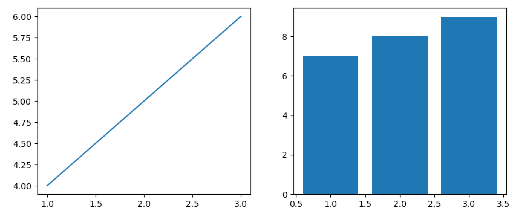
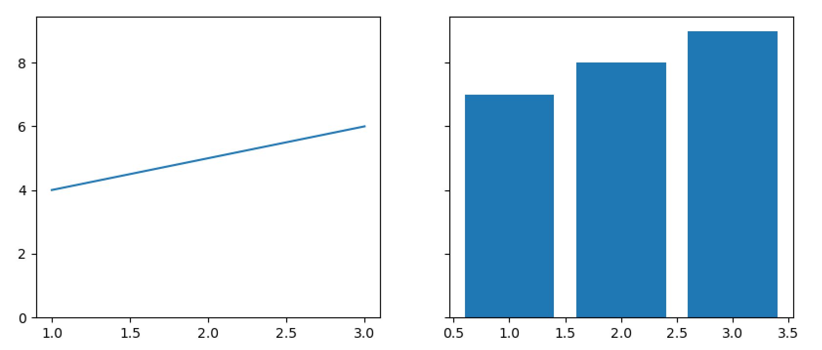
这一点对于子图的美观性还挺重要的
不使用共用y轴
使用公用y轴
figsize:画布尺寸(宽, 高,单位英寸)
fig, (ax1, ax2) = plt.subplots(1, 2, sharey=True, figsize=(10, 4))
ax1.plot([1, 2, 3], [4, 5, 6])
ax2.bar([1, 2, 3], [7, 8, 9])
通过色块的颜色表现第三维数据的数值大小
使用colorbar函数显示颜色和数值的映射条
函数原型:cbar = plt.colorbar(mappable, ax=ax, cax=cax, **kwargs)
mappable:必选,关联的数据对象(如 im = ax.imshow(data))
ax:指定父坐标系,色条将自动放置在其旁cax:自定义色条坐标系,实现精确布局orientation='horizontal'
将二维数组(如矩阵、图像)渲染为均匀网格色块,适用于规则排布的离散数据或真实图像
plt.imshow(data, cmap='hot', origin='lower', interpolation='nearest')
data的数据格式
(M, N):灰度图(标量值映射为颜色)。
(M, N, 3):RGB 彩色图像。
(M, N, 4):RGBA 图像(含透明度)
cmap:颜色映射(如 'viridis'、'gray'),将标量值映射为颜色。
origin:坐标系方向,'upper'(数组左上角为图像左上角,默认)或 'lower'(数组左下角为图像左下角)。
aspect:纵横比控制,'equal'(像素为方形)或 'auto'(自适应画布)。
interpolation:像素插值方法(如 'nearest' 保留锐边,'bilinear' 平滑过渡)。
vmin/vmax:颜色映射的值域范围限制
注意事项 当用 imshow 显示矩阵时,若未设置 origin='lower',图像可能上下翻转(因数组原点在左上角,而笛卡尔坐标系原点在左下角
img = np.arange(100).reshape(10, 10)
plt.imshow(img)
plt.colorbar(img)
先通过plt.imshow(img)指定一个数据对象
在二维平面上绘制三维数据的等值线,并在相邻等值线间填充颜色,形成连续色块
from scipy.stats import multivariate_nor
rv = multivariate_normal(mean=(0, 0),cov = ((1,0.5),(0.5,0.5)))
print(rv.pdf((0, 0))) #(x,y)->f(x,y)
创建多元正态分布对象并从指定均值和协方差矩阵
mean=(0, 0):均值向量,表示两个维度的期望值均为0cov=((1, 0.5), (0.5, 0.5)):协方差矩阵,表示:
第一个维度的方差为 1(对角线元素)。
第二个维度的方差为 0.5(对角线元素)。
两个维度间的协方差为 0.5(非对角线元素),说明两者存在正相关性
norm_x,norm_y = np.mgrid[-1:1:.01,-1:1:.01]
pos = np.dstack((norm_x,norm_y)) # pos=>(200, 200, 2)三位数组
prob_density = rv.pdf(pos)
print(pos.shape,prob_density.shape)
plt.imshow(prob_density)
plt.colorbar()
两个函数的原点约定不同,可以使用imshow()的origin参数调整
from mpl_toolkits.mplot3d import axes3d
ax = plt.figure().add_subplot(projection='3d')
#Plotthe3D surface
ax.plot_surface(norm_x,norm_y,prob_density,
            edgecolor='royalblue',lw=0.5,
            rstride=8,cstride=8,
            alpha=0.3)
ax.set( xlim=(-1, 1),ylim=(-1, 1),zlim=(0, 0.4),
        xlabel='x',ylabel='y',zlabel='f(x,y)')
plt.show()
P, Q = np.mgrid[-1:1:.002,-1:1:.002]
dP =-Q # \dot{p}
dQ = P # \dot{q}
plt.streamplot(Q, P, dQ, dP)
from scipy import special
x = np.linspace(0, 6, 100)
y_values = [special.jv(n,x) for n in range(0, 5)] #第一类Bessel函数
for i,y in enumerate(y_values):
    plt.plot(x,y,label=f"Order {i}")
plt.legend()
plt.xlabel("x")
plt.ylabel("valuesofBesselfunction")